

There's an "L" in This Teacup


Take a look at the Tea'l Cup Studio logo, and you'll notice an intentional design choice; a drip-like apostrophe that makes the little "L" appear to make a splash among the rest of the letters. Why is that? Why the apostrophe when simply “teal cup" describes the object behind the brand? Well, while it is true that my little celadon tea set inspired both the brand name and color, more importantly, it inspired its purpose.
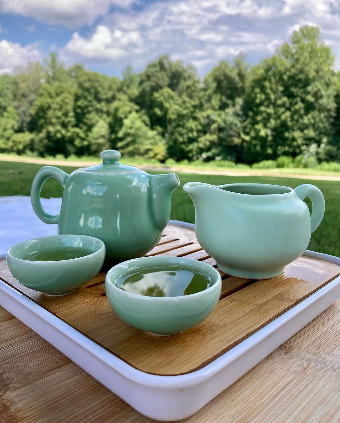
Like a teacup, the brand is a vessel; a vessel through which I get to pour God’s overflowing love out from my life into others.
The “L” in Tea’l Cup Studio stands for God’s:
Love,
Light, and biblical
Life-Lessons that He’s helped me
Learn.
It therefore also stands for my dedication to share all those things to encourage others, through:
Literature,
Language, and (both symbolically and deliciously),
Loose Leaf tea.
I hope to steward this promise well as I continue to walk with the Lord, and pray that the blessings of faithful encouragement become Tea'l Cup Studio's
Lasting Legacy.


